AI Image Style Guide: From Style Names to Executable Visual Rules
“Cinematic,” “watercolor,” and “premium 3D” are not complete directions. Results are shaped by how the camera observes the subject, how light builds space, how color is distributed, how materials react, and how edges and detail are treated. This guide turns six common style families into controllable, reusable, and testable visual variables.
The six examples below were generated with Seedream 5.0 Pro from their corresponding prompts, showing how the same content structure behaves across different dominant media.
First separate content, form, and style
Subject and setting answer what to depict, composition answers how to arrange it, and style answers which visual rules should render it. When all three are blended into one abstract phrase, the model cannot tell what must remain. Lock content first, choose one primary style, then define it with observable variables.
Six style families and what they control
The point of classification is not to label an image, but to identify which variables need control. A visual can carry secondary influences, but should usually have one dominant medium.
Photography
Defined by lens, exposure, lighting setup, depth of field, and grading. Specify how it was photographed, not merely “photorealistic.”
Cinema
Defined by narrative moment, implied camera movement, blocking, aspect ratio, and grade. Cinema is not just letterboxing.
Illustration
Defined by line language, shape simplification, value hierarchy, and communication goal. Editorial and picture-book illustration solve different problems.
Physical media
Defined by pigment, surface, tool marks, wet/dry behavior, and production imperfections. Describe how the material leaves marks.
3D and materials
Defined by modeling language, surface material, renderer logic, lighting, and camera. Do not stack clay and glass as decorative tags without intent.
Graphic design
Defined by grid, typographic hierarchy, whitespace, image–type relationships, and print process. It controls information order, not only color.
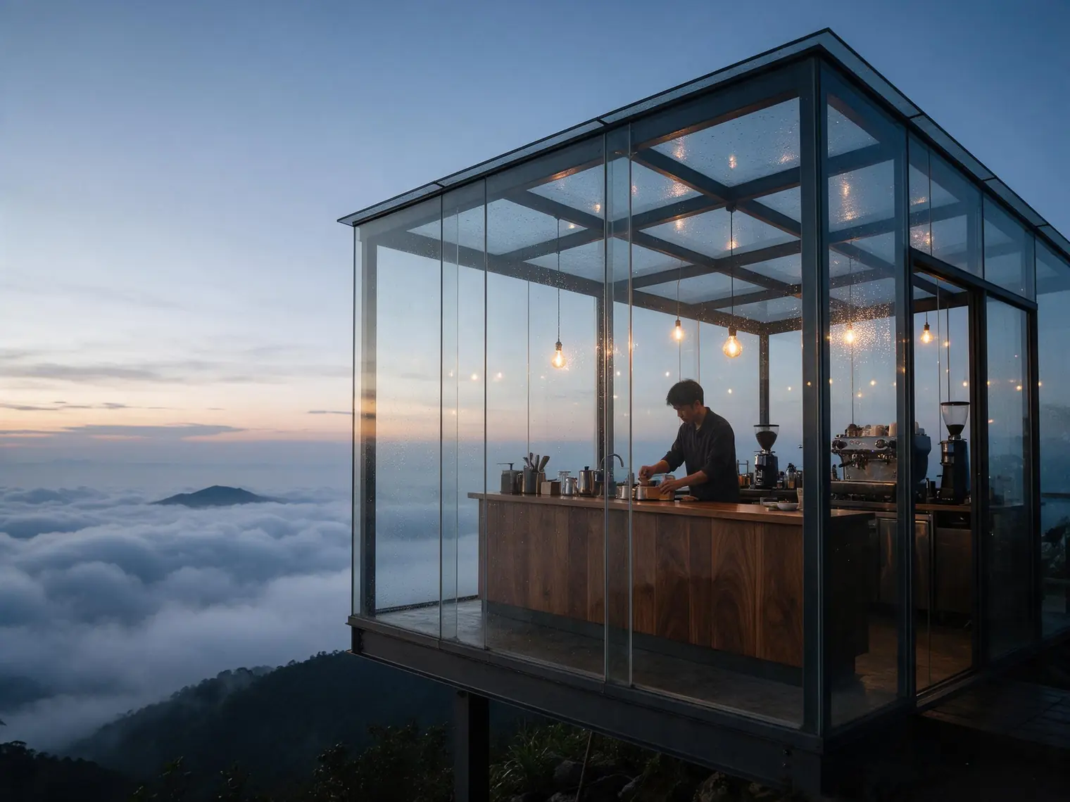
1. Photography: describe the capture system
A common photography mistake is asking for a wide environmental portrait, 85mm compression, macro detail, and panoramic framing at once. These imply incompatible viewing distances and perspective. Choose purpose first, then lens tendency, shot scale, key light, and finish.
24–35mm emphasizes environment and perspective; 50mm feels neutral; 85–135mm compresses backgrounds and isolates people or products.
Define direction, softness, contrast ratio, and environmental bounce instead of “premium lighting.”
Choose clean digital, film grain, editorial retouching, or documentary restraint—do not use all at once.
New example: a mountaintop greenhouse café before dawn
2. Cinema: describe narrative, not just “cinematic”
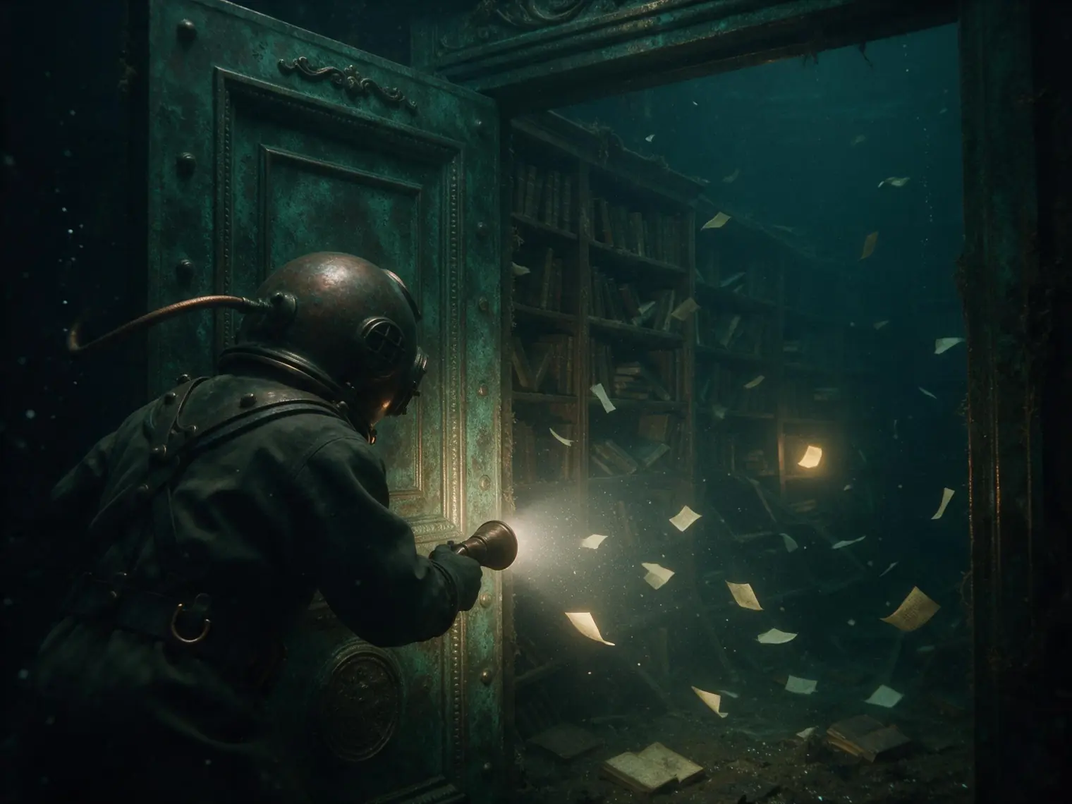
A cinematic frame is first a moment in a story. Define what is happening, the camera’s relationship to the character, the foreground–background structure, and the narrative role of light. Color grade is only the final layer.
New example: a diver enters a sunken library
3. Illustration: define line, shape, and communication goal
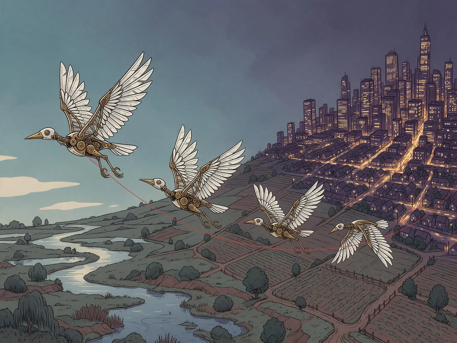
Illustration is not one medium. Picture books prioritize emotion and readable silhouettes, editorial work prioritizes conceptual metaphor, and technical illustration prioritizes structural accuracy. State the communication task, then define line weight, shape simplification, perspective, and value steps.
New example: migration route of mechanical birds
4. Physical media: describe how materials behave
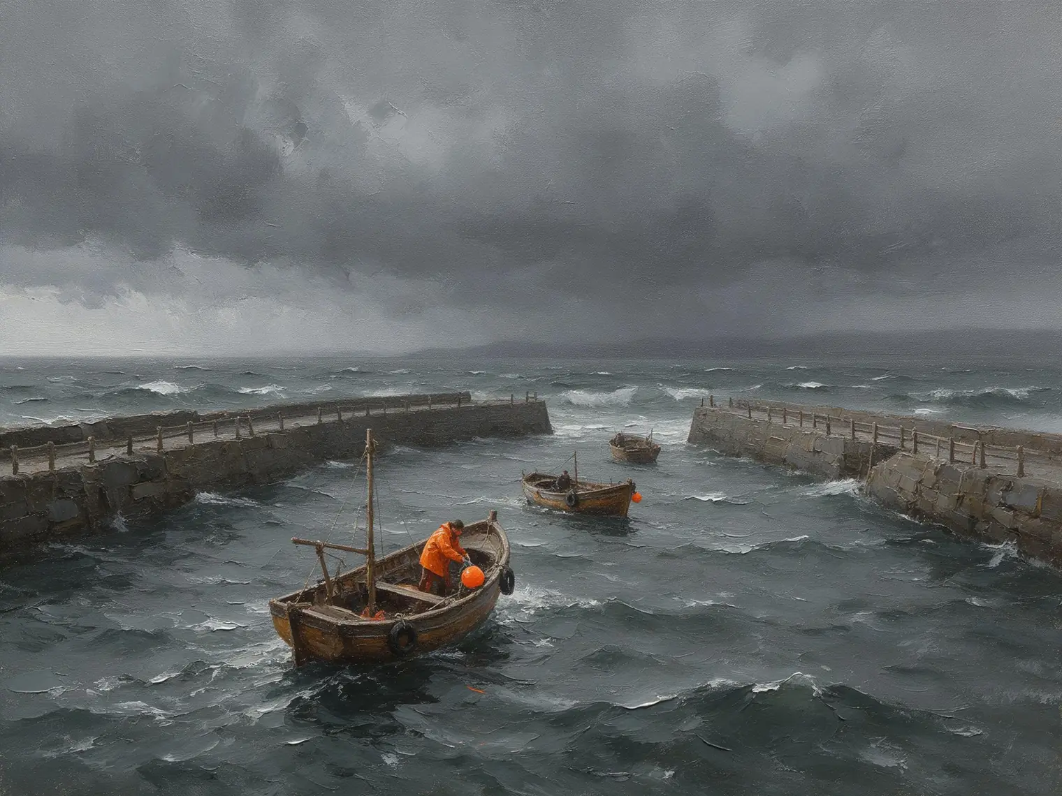
“Oil painting” alone often produces digital illustration with a brush filter. For believable physical media, define the surface, pigment thickness, tool direction, layering, and imperfections—for example, canvas showing through thin passages and highlights rising along consistent impasto strokes.
New example: fishing boats returning before a storm
5. 3D style: lock modeling and material rules
A 3D prompt should answer three questions: how forms are modeled, what surfaces are made of, and how light behaves physically. Low-poly, clay, glass, and realistic PBR belong to different systems; if mixed, define which is dominant and which is local.
New example: a miniature night market inside a capsule

6. Graphic design: control information order
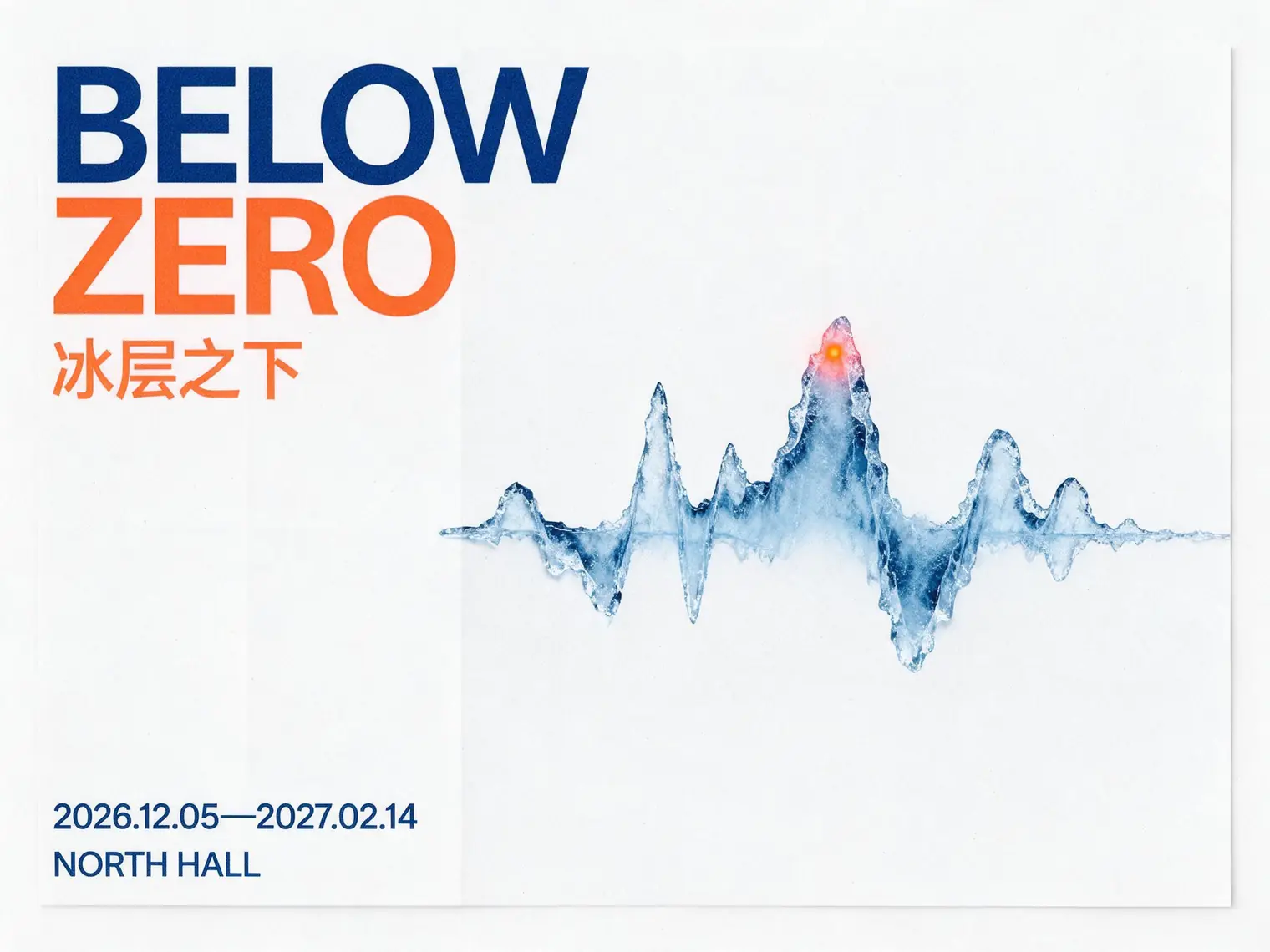
Graphic design is not an image with a few lines of type. Define reading order first, then grid, whitespace, type hierarchy, and image ratio. For generated typography, list exact copy together and limit its volume. When body copy must be exact, generate the visual base first and typeset in design software.
New example: polar sound-art exhibition
Why style terms conflict
To decide whether two styles can combine, compare what they demand from the same variables. If both require incompatible space, edge, or material behavior, establish a clear hierarchy or remove one.
Flat vector illustration + realistic depth of field: one flattens space while the other simulates optical depth.
Rough woodcut + smooth PBR glass: edge and material systems work against each other.
Cinematic composition + oil paint: cinema controls framing and narrative; paint controls surface and marks.
Swiss grid + collage imagery: grid organizes information while collage defines the hero texture.
Build a personal style benchmark
A useful comparison controls variables. Do not change the subject for every style or you cannot tell whether differences come from style or content. Start with one neutral baseline, then replace only the style module.
- Lock model, seed when available, aspect ratio, and quality.
- Lock subject, action, setting, count, and placement.
- Replace only the primary style and its five visual variables.
- Score composition adherence, style strength, detail consistency, and usability.
- Save successful and failed wording, not only final images.
Keep one style across a series
Series consistency comes from locked variables, not repeatedly saying “keep consistent.” Build an invariant style anchor and append it to every prompt. Actions and scenes can change, but the following should not.
Viewpoint
Lens tendency, camera height, shot scale, and perspective strength.
Light and color
Key-light direction, softness, warm/cool relation, and three to five core colors.
Surface
Line weight, material, grain, brushwork, or rendering method.
Constraints
Excluded media, colors, decoration, and finishing effects.
Conclusion: write style as rules, not labels
The most reliable style prompts usually have one dominant medium and clearly define viewpoint, light, color, material, edge, and space. First decide whether the image is primarily photography, cinema, illustration, physical media, 3D, or graphic design; then control the variables that matter to that family. The result is shorter, clearer, and easier to reproduce.
Continue: the universal AI image prompt formula →
FAQ
Is one style name enough in an AI image prompt?
Usually not. A style name sets a direction, but reliable control also requires observable variables such as lens, light, palette, material, edge treatment, space, and finishing.
Why do many style words sometimes produce a generic image?
Different styles can demand conflicting edge, space, material, and color behavior. The model compromises, often weakening the distinctive traits of each style.
How do I keep one style across a series?
Lock the subject description, camera, palette, key-light direction, material vocabulary, and finishing treatment. Change only action or scene, and keep reference-image roles consistent.